rebrand rollout
Digital, packaging & visual systems (2023–2025)
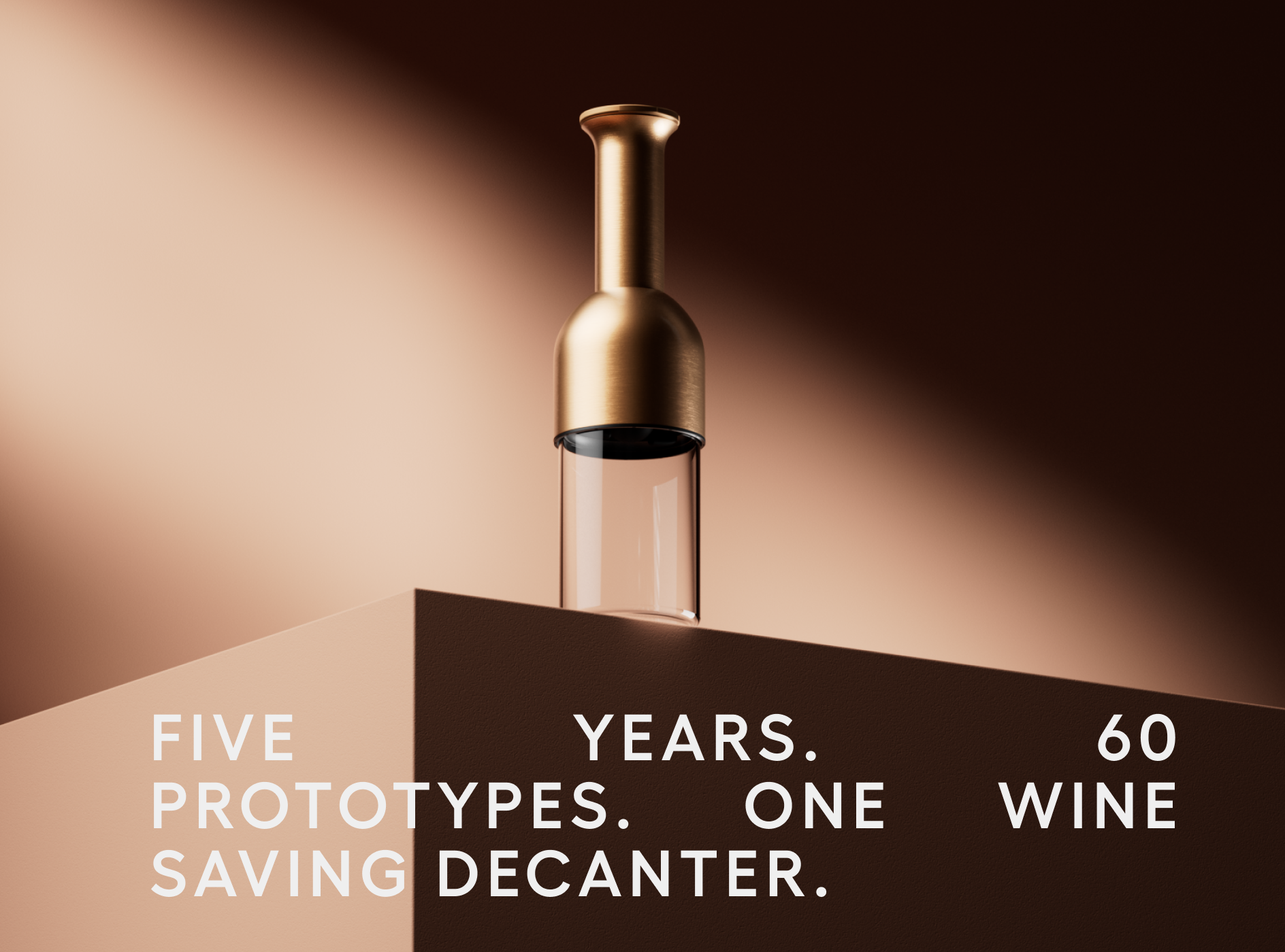
ETO makes a wine decanter that aerates in a way nothing else does. The problem was that nothing about how it looked or arrived said so a plain black tube, a product-led brand with no visual world around it.
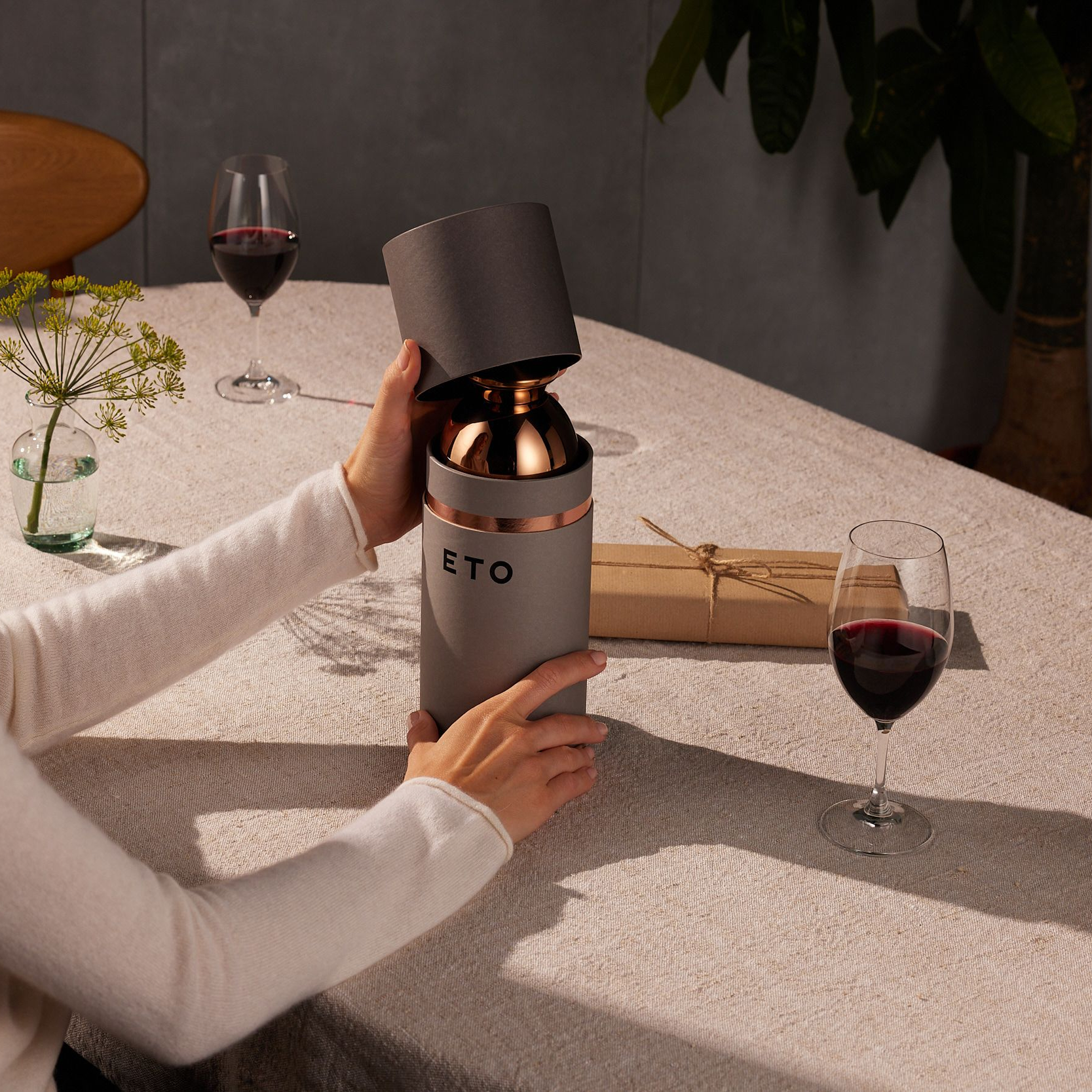
I redesigned the primary packaging from concept to production: a tonal system that reads as considered rather than technical, with the weight of the pack significantly reduced and the non-recyclable elements replaced. It's the first thing a customer touches, and for a DTC brand at this price it does most of the work of justifying it.
Around that I built the system the rest of the brand runs on. A palette of earthy mid-tones drawn from the materials themselves, and a typographic pairing of Hellix and Proxima Nova, with Hellix drawing on the geometric Art Deco quality of the mark, Proxima carrying the volume of everyday copy across web and packaging. Working with a development agency, I set the creative direction for a new website built to tell the story and prove the quality at the same time, with a finish selector bringing home the glass and metal finishes through 3D animatics.
A logo and early packaging sketches had been delivered shortly before I joined. The rest of the system was built from there.
The system launched in early 2025 and now defines how ETO shows up across product, digital and everything since.